
How to Resize an Image Without Stretching It
Keep the original proportions when you resize a photo, and learn when to crop or add padding for a fixed-size image.
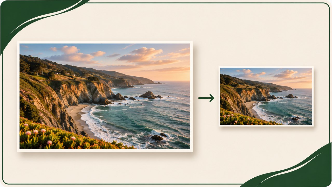
Resize an image without changing its shape
To resize an image without stretching it, keep the aspect ratio locked and change either the width or the height. The second dimension should adjust automatically. A 2400 × 1600 photo resized to 1200 pixels wide becomes 1200 × 800 pixels tall. Every part of the photo is reduced by the same proportion, so faces, circles, lettering and product outlines keep their original shape.
Open the FixHubLab Image Resizer at https://fixhublab.com/tools/image-resizer and choose a JPG, PNG or WebP image. Leave “Keep aspect ratio” checked. Enter the width or height you need, choose an output format, and click “Resize image.” Check the dimensions shown with the result before downloading. Keep the downloaded file separate from the original, especially if the photo will be reused in another layout.
The method changes when your destination requires two fixed dimensions with a different shape. A rectangle cannot fill a square without cropping, adding empty space, or distorting the image. Decide which trade-off is acceptable before entering the width and height. That choice matters more than the particular resizing tool you use.
Start with what the destination actually asks for
Before opening the tool, find out whether the requirement is a specific pixel size, a maximum width, a shape such as a square, or a file-size limit. Those are different requirements. A form asking for “up to 2 MB” is limiting the file size. A form asking for “1200 × 800 px” is describing dimensions. A website may specify both. Check the precise requirement so you do not discard more detail than necessary.
If a blog template asks for an image at least 1200 pixels wide, an existing 1800-pixel-wide photo might already be usable. If you need a smaller copy, set the width to 1200 and keep the ratio locked. If the template displays every image inside a fixed crop, leave extra room around the subject so that its automatic crop can trim the edges safely. Use a preview in the destination when you have one.
If you received instructions from somebody else, distinguish “resize to fit” from “fill the frame.” Fitting means the entire image stays visible inside the frame and some space may be left around it. Filling means the frame has no empty space, so the edges of the image may be cut off. Ask which outcome they want when important details sit close to the edges.
Read the aspect ratio before choosing dimensions
Aspect ratio is the relationship between width and height. A photo that is 2400 pixels wide and 1600 pixels tall has a ratio of 3:2, because both numbers divide by 800. A 1200 × 800 copy and a 600 × 400 copy have the same ratio. Their pixel counts differ, but the overall shape is identical. A 1080 × 1080 square has a 1:1 ratio. A 1920 × 1080 landscape rectangle has a 16:9 ratio.
The lock in the image resizer preserves the source ratio. If you change the width, it calculates the height using the original proportions. If you change the height, it calculates the width. This is useful when a picture must fit in a column of known width, or when you want to make a group of portraits the same height while letting their widths vary.
You can also check two layouts without reducing both ratios to simple numbers. Multiply the original width by the proposed height. Then multiply the original height by the proposed width. If the products are the same, the ratios match exactly. If they differ substantially, entering both proposed dimensions with the lock off will stretch the image. A small difference caused by rounding to a whole pixel is usually inconsequential.
A worked example for a landscape photo
Suppose you have a 2400 × 1600 photo and you want it to display at 1200 pixels wide. Divide the target width by the original width: 1200 ÷ 2400 = 0.5. Multiply the original height by that factor: 1600 × 0.5 = 800. The final image is 1200 × 800. A circular badge in the original remains circular, and the distance between objects scales by the same factor in both directions.
If you only know the height you need, use the same logic in reverse. To make the photo 600 pixels tall, divide 600 by 1600 and multiply the width by the answer. The width becomes 900 pixels. The result is 900 × 600. Starting from a target height is useful for a row of images that must align at the top and bottom even if each image has a different width.
For a target width of 1000 pixels, the calculated height is 666.67 pixels. An image file needs a whole number of pixels, so 667 is a sensible result. An ordinary preview will not reveal the difference between the mathematical height and the rounded value. Pay more attention to choosing the correct original and keeping the lock checked than to these small rounding differences.
How to fit inside a fixed width and height without cutting anything off
Imagine the same 2400 × 1600 photo must fit inside a space that is at most 1000 pixels wide and 600 pixels high. Start by comparing both limits with the original: 1000 ÷ 2400 is about 0.417, and 600 ÷ 1600 is 0.375. Choose the smaller factor so neither dimension runs over its limit. The fitted result is 900 × 600.
You can find the answer in the resizer without a calculator. Keep the aspect ratio locked and set the width to 1000. The resulting height will be about 667, which exceeds your limit. Set the height to 600 instead. The width changes to 900, which fits. This approach is useful for profile photos with maximum dimensions, attachments for an application, or a gallery that limits the available display area.
Fitting inside a fixed frame does not automatically add padding. A 900 × 600 file is still 900 × 600. If the destination insists on a file that is exactly 1000 × 600, place the fitted photo on a 1000 × 600 canvas in an editor and center it. The leftover 100 pixels become 50 pixels on each side. Choose a background colour that suits the destination or a transparent background if your format and destination support it.
When to crop for a square image
Crop when the image needs to fill a square and trimming some of the scene is acceptable. If a 2400 × 1600 landscape photo has a subject near its centre, a square crop can use a 1600 × 1600 region. Then resize that square to the required dimensions, such as 1080 × 1080. With the aspect ratio locked, setting one dimension will make the other match it. FixHubLab’s Image Editor is at https://fixhublab.com/tools/image-editor.
Try to decide what to retain before cropping. A photograph of a person may need room above the head and enough space for their hands. A product image may need the entire item and an even margin around it. A screenshot may need a label or value in a corner. A centred crop is a starting point. Move the crop if the original subject is off-centre or if the default crop cuts off a meaningful detail.
Crop from the best available source before making a small final copy. For example, if you first shrink the 2400 × 1600 original to 1200 × 800, a later square crop can use at most an 800 × 800 region. If the required square is 1080 × 1080, you would then have to enlarge those cropped pixels. Cropping the original first gives you more source detail for the final square.
When to add padding instead
Padding is useful when losing any part of the image would change its meaning. A family photo might have somebody standing at one edge. A product photo might show accessories beside the main item. A screenshot might contain notes, arrows or labels you need to retain. In those cases, fit the image to the target frame with its ratio locked, then fill the remaining canvas with a suitable background.
For a 1080 × 1080 square, the 3:2 photo in our example fits at 1080 × 720. There are 360 unused pixels in the vertical direction. If you centre the photo, put 180 pixels of padding above it and 180 below it. Equal padding is useful when you want the picture to look centred, but you can place it a little higher if you are saving space for a caption underneath.
Think about the surface on which the finished file will appear. White padding can blend into a white page, while a contrasting colour makes the border visible. If you plan to layer the image over another background, a format that supports transparency can make the empty space easier to reuse. Preview the file against the actual page or design because transparency can look different in an editor and on the final site.
Resize a wide thumbnail and keep the important details visible
For a project that needs a 1920 × 1080 image, start with a landscape image and check whether its shape is already 16:9. A 2400 × 1350 image matches that shape and can be resized with the ratio locked. A 2400 × 1600 image is taller relative to its width. Crop to a wide shape if the background can be trimmed, or fit the complete image inside the new canvas if the top and bottom are important.
FixHubLab has a dedicated preset at https://fixhublab.com/tools/youtube-thumbnail-resizer. Check the instructions and preview for the destination before downloading. If your image has text, a face, or a product near the edge, look at the preview at a small size as well. An image that looks balanced at full width can become difficult to read when it appears as a small card on a mobile screen.
A reference image can help decide how to compose the thumbnail. For example, if you're creating several covers for the same blog, compare the size and position of the subjects in the existing covers. A consistent visual rhythm can make the list easier to scan. Maintain that consistency by moving the crop window or adjusting the padding, while leaving the aspect ratio of individual objects intact.
Choose an output format after you settle the dimensions
Use a format the destination accepts. JPG is a practical choice for many ordinary photographs without transparency. PNG is useful when you need to keep transparent parts of an image. WebP is another option when the website or software that receives the file supports it. The output format does not determine the pixel dimensions by itself. Review the chosen width and height separately.
A format change also does not solve a composition issue. Converting a rectangular JPG to PNG leaves it rectangular. A JPG with a solid background stays solid after conversion. If the job is simply to change a JPG into a PNG while keeping its dimensions, use https://fixhublab.com/tools/jpg-to-png. If the subject needs a transparent background, remove the background before exporting an appropriate file.
Compare the original and output file size if there is an upload limit. Two images with the same dimensions can have different file sizes due to the format, image detail and compression settings. Fix the dimensions first when the destination has an exact pixel requirement. If the result is still too large, use the Image Compressor at https://fixhublab.com/tools/image-compressor and check that the visible quality remains appropriate.
Preserve detail in screenshots, logos and small photos
Screen captures need a slightly different preview from photos. Look at the result at the actual size it will appear on the page, and check whether the smallest labels and text are legible. A screenshot of an entire screen may contain too much information to read in a narrow column. If the tutorial is about one menu, crop to that menu from the original screenshot and then resize the crop for the article.
When resizing a logo, check the edges and any thin lettering. A logo made for a wide website header may become too small to read when fitted into a square. Use a brand-approved square version if you already have one. Otherwise, place the wide logo on an appropriately coloured canvas and preserve its proportions. Keeping space around the mark often looks cleaner than stretching it to fill every available pixel.
Enlarging a small photo can make it physically larger on the page, but the resize cannot recover information that is missing from the source. If a small portrait looks soft after doubling its width, seek the original photo or choose a layout that uses a smaller version. If you must use the enlarged copy, check it at its actual display size rather than judging only by how it looks zoomed out.
Resize multiple images to a consistent size
Suppose you are preparing a batch of blog images for the same article column. If the goal is a consistent maximum width, choose that width for each image with the ratio locked. Landscape images and portrait images will have different heights, but they will all fit the column. For a portrait that is already narrower than the target when it looks acceptable, keep its smaller dimensions to avoid unnecessary enlargement.
If you need an evenly sized gallery, decide whether to use one shared crop shape or to fit every image inside a frame with padding. A shared crop usually suits subjects with plenty of background. Padding works better for mixed product shapes that must stay fully visible. If you use padding, make the frame colour and edge spacing consistent. This gives the gallery a predictable layout while preserving each subject’s shape.
If multiple copies of a photo are needed, create each output from the best source copy. Resizing an already reduced image again leaves fewer pixels to work with. Clear filenames also make the results easier to manage. Including the pixel dimensions in the name can help you find the correct copy when several versions are sitting in the same folder.
Review the result before uploading
Compare the original and the resized image side by side. Look for obvious distortion in a face, a round object, a company logo, or a line of text you know well. Check the displayed pixel dimensions and make sure you selected the expected output format. If a part of the image disappeared, work out whether you cropped it earlier or whether the destination is cropping it when displayed.
If the downloadable image looks right but the uploaded version looks stretched, check the destination’s layout rules. Some templates fill a frame using their own crop or set both display dimensions. Try previewing the image in a different layout, or prepare a version that matches the frame’s ratio. Keep the original while you test, since one version may suit the blog, while another suits a social card.
Use this sequence whenever you are unsure: identify the destination’s dimensions, lock the aspect ratio, choose one dimension, and preview the result. If two exact dimensions are required and the shapes differ, decide whether to crop or add padding. Check the image at its intended display size, confirm it meets any file-size limit, and save the final copy separately.